

Improve shopping tools and features to enhance the customer experience.

Traditionally, RVs and vans have appealed to older demographics with the financial means to purchase these vehicles. But then COVID-19 happened. Van life became increasingly popular, especially among younger demographics. To handle the surge in website traffic, the platform needed to be user-friendly for tech-savvy customers shopping for RVs.
Design Hypothesis
We believe that improving the core shopping tools, we can enhance the customer experience, which will lead to increased website traffic, user engagement, and dealership visits for purchases.
Areas of Focus
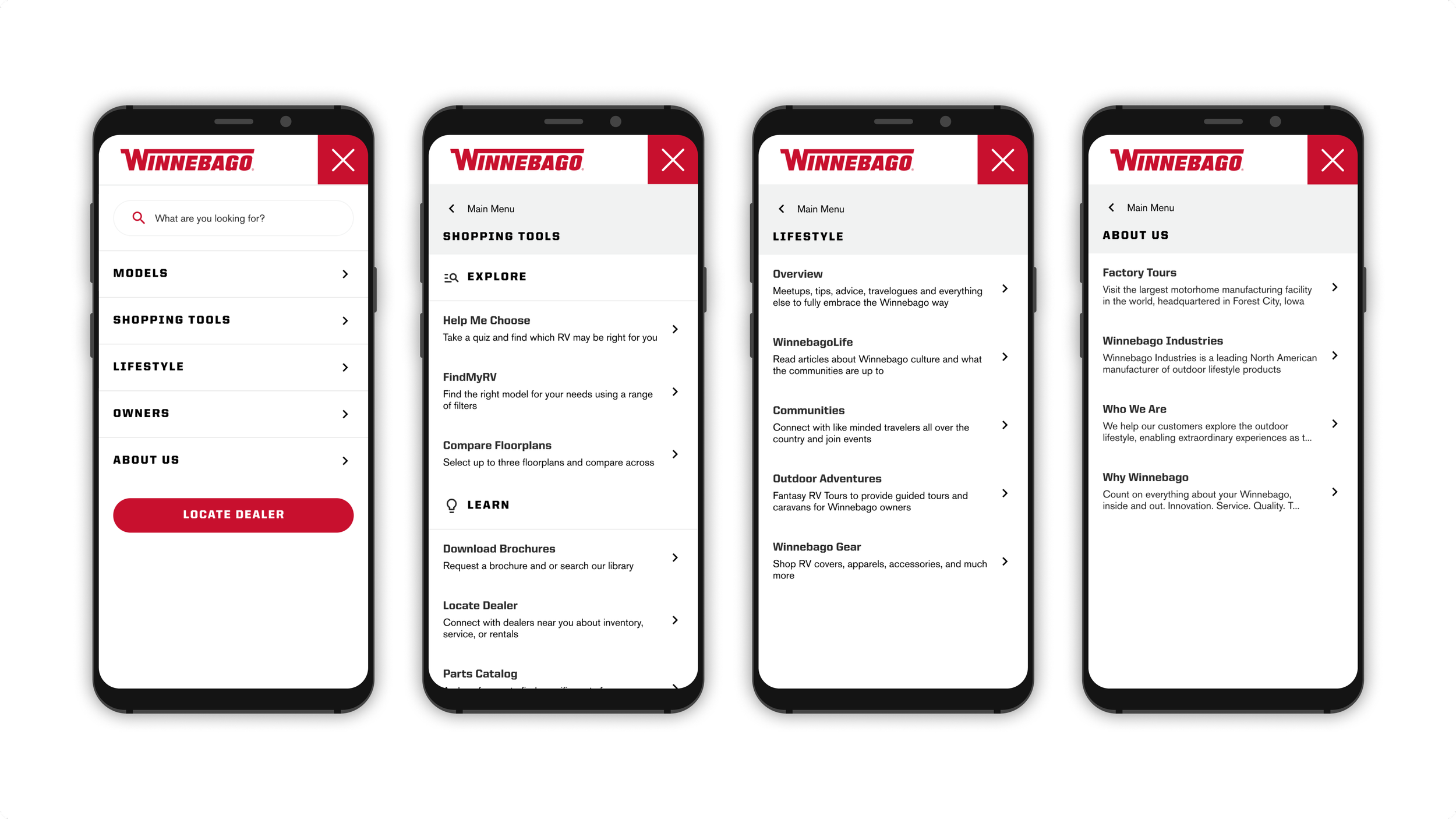
Global navigation
Compare Tool
New RVs


The Outcomes


The Design Process
The Approach
This isn’t a website redesign overhaul. My team and I are approaching this with a lean strategy. Kicking off each feature with requirements gathering and launching in increments.
Design Hypothesis
We believe that customers will have a better shopping experience
So if we improve the core shopping tools
Then we will see an increase of website traffic, activities, and users going into the dealership to make their purchase.
Core Areas of Focus

Global Navigation
Restructuring the information architecture is important for users to have a better way-finding experience, especially one that makes sense. This will impact the global navigation and prioritizing mobile first approach for responsive design.

New RVs
This page is known as the “Insider” page where people can take a sneak peek at new RVs and and floorplans . This creates excitement around new RV rollouts and how to engage with that information.

Compare Floorplans
Comparing is a common shopping behavior. Enhancing the comparison tool will begin to help users get to the decision making level sooner.
The Problem
Global Navigation
The current navigation was not user friendly especially on mobile. Searching and finding RVs was challenging with the different types of models, varying class types, and hundreds of floor plans. Improving the findability of RVs was high priority.
Solution
Mega Menu
Organizing and grouping contents to match user expectations and reduce friction. A mega menu is best suited for large number of options and revealing lower-level site pages at a glance. It gives the flexibility of adding more pages, illustrations, and visuals.


The Problem
Comparing Floorplans
Users bring their shopping behaviors and expectations to this website. If it doesn’t work the way people expect it to, it can create friction. Winnebago doesn’t compare models to models because it isn’t quite apples to apples. Users can compare floorplans to floorplans. Comparing should be easy and simple.
Solution
Compare Drawer
This approach meets users where they’re at in their shopping journey. While browsing floorplans, users are able to make selections and compare in a drawer view. This gives the flexibility to exit and resume browsing.


More Case Studies
Root 🔒
Member Telehealth Experience Redefined
Little Caesars Fundraising
From Brochure to Digital
Meijer
Grocery Order Fulfillment